Anne Fougeron’s Translucence House
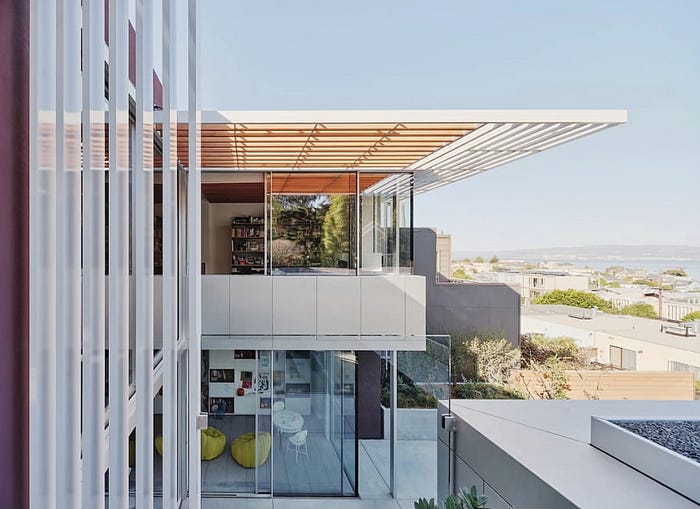
Perched upon a bluff and next to a community garden in San Francisco sits Fougeron Architecture’s Translucence house, a surgically expanded mid-century renovation that plays upon the perceptions of light/dark, private/public, and inside/outside. The site was originally filled and leveled in the early 1960s and underwent an ill-conceived renovation leaving the structure feeling fragmented and dysfunctional. Thanks to the team at the Fougeron’s firm, a nationally recognized design powerhouse, the space-as-art approach to the newly envisioned structure is brimming with conceptual beauty and modernist flair through a series of interventions constructed throughout the existing box.

Described as “an urban retreat for a young family on a remarkable site”, the Translucence house displays its exploration of indoors vs. outdoors by use of glass and natural light to define environments and the composition as a whole. Square trellises elegantly adorn the external structure, providing shade without disrupting the expansiveness of the design. Drawing from California’s light and space movement (Turell would be pleased), the home exists in harmony with the shifting of light throughout the day through ingenious implementations of “smart glass” technology, which transforms as heat and light affect its opacity. The firm sees its interventions as expressions of this idea, from the all-glass pavilion enclosing a family and dining room to the master suite reimagined as a singular, luminous volume expanding the full expanse of the upper floor.

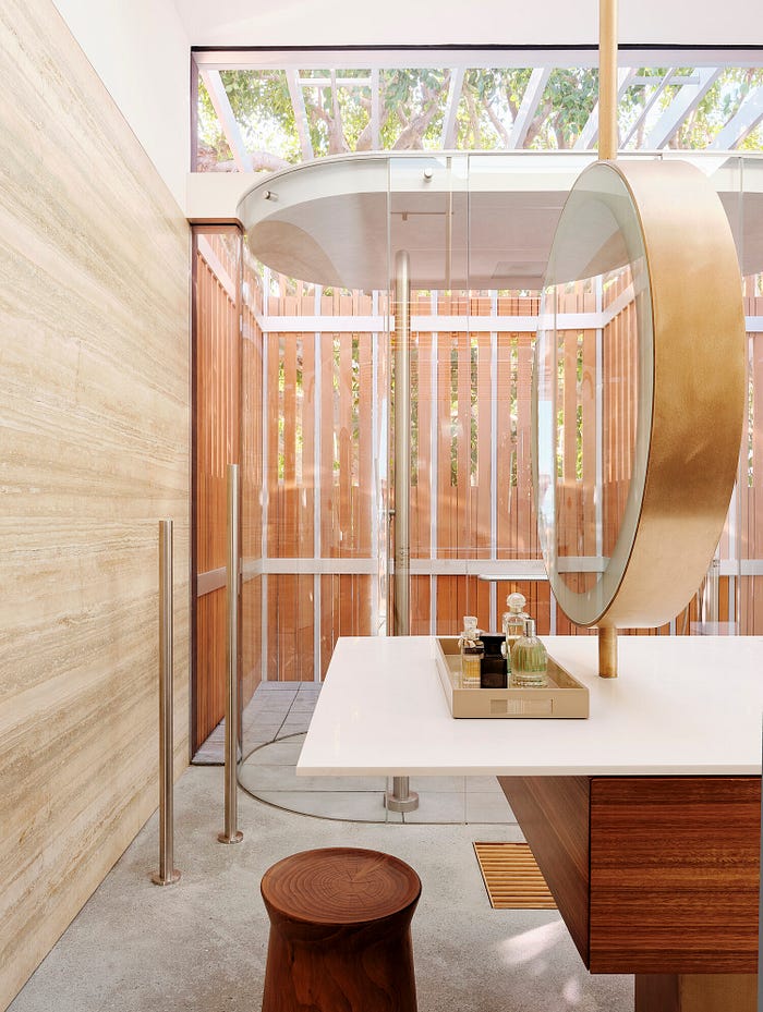
The bathroom, in collaboration with WATRLINE, is a subtly provocative feature once again playing with the exploration of what it feels like to be in an indoor and outdoor space simultaneously. The curved design creates a welcomed contrast to the rest of the home, featuring two JEE-O Original Shower 02’s pushed to a screened front balcony. The showers themselves, with their curved silhouettes, show how this particular design can exist in a multitude of environments while remaining bold and unobtrusive. We loved their implementation of this design into an already forward-thinking structure, as it reminds us that “feeling” outside can be relative to the design in which our products live.
